South Shore Glass Co. - Website Redesign

Redesigned a glazing company’s website to restore visibility and trustRole: UX / UI Designer
〰️
Tools: Figma, Wordpress
〰️
Timeline: 6 weeks
〰️
Project: Website Redesign
〰️
Role: UX / UI Designer 〰️ Tools: Figma, Wordpress 〰️ Timeline: 6 weeks 〰️ Project: Website Redesign 〰️

Summary
South Shore Glass is a local glazing company specializing in residential and commercial glass installation. When I began this project, their website had been offline for over a year due to a failed redesign, leaving the business without an online presence.
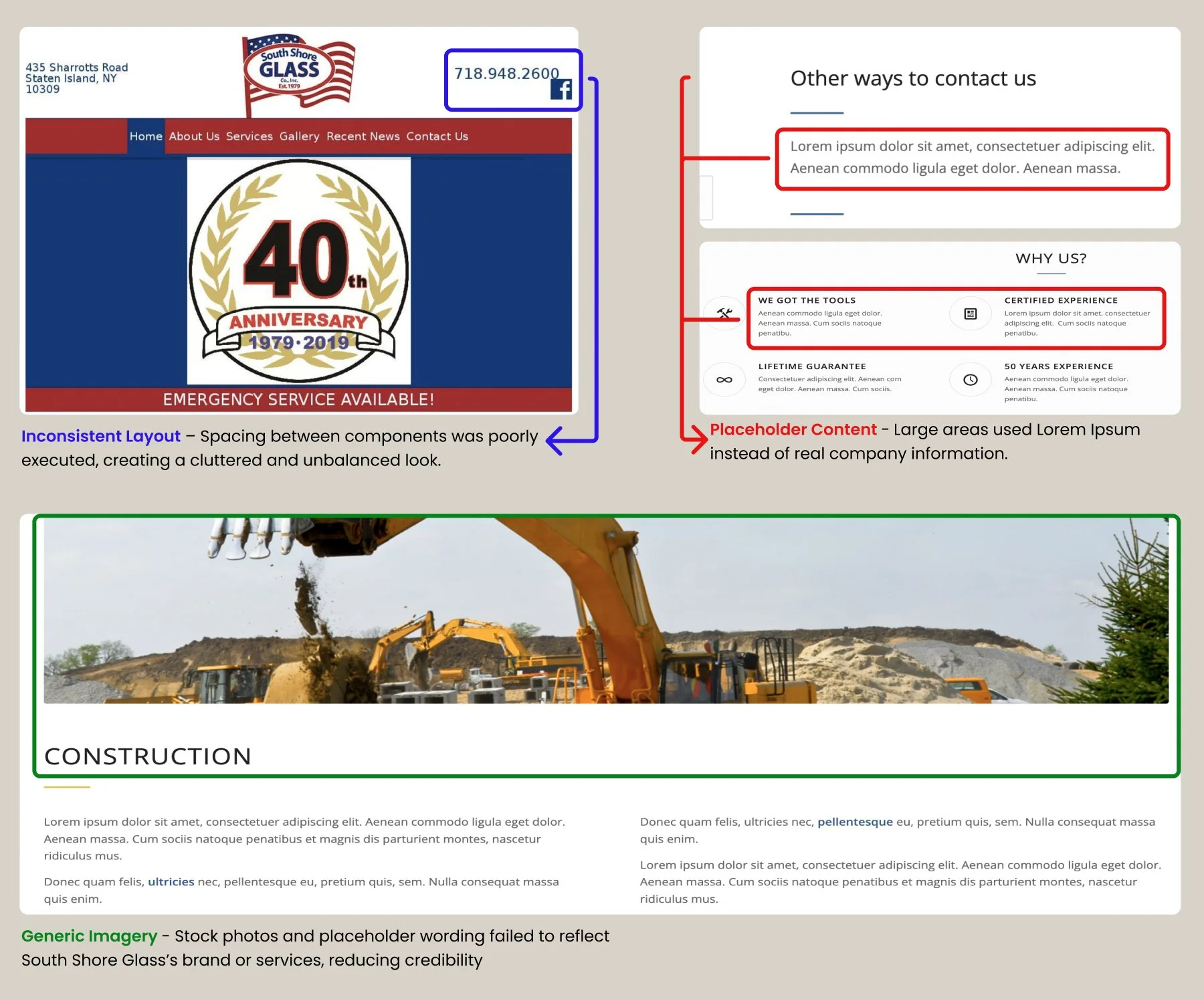
I designed and launched a new responsive website that restored their visibility, improved usability, and rebuilt credibility. My work included creating a clear information structure, replacing placeholder content with their own imagery, modernizing the visual design, and adding a quote request for to help customers connect with the business.
Pain Points
Research & Insights

NYC glass, corp.
Positive Takeaways
Crisp, up-to-date photos
Dropdown menu for glass applications
Map integration that opens directly to location
Clear contact form
Negative Takeaways
Poor spacing and padding reduce readability
Striped background is visually distracting
Heavy use of photos with little project information

AM Glass
Positive Takeaways
All services are clearly visible and easy to navigate.
Footer allows navigation from both top and bottom of the page.
Well-padded content with appropriate whitespace.
Negative Takeaways
Oversized header takes up too much screen space.
Hover effects overlap text, reducing legibility.

NYC Glass & Door
Positive Takeaways
Appealing images that capture user interest.
Prominent "Request a Quote" button.
Project gallery highlights completed work.
Negative Takeaways
Text shadow effects make lettering hard to read.
Bright, clashing colors reduce professionalism.
Black box at the bottom hides some lettering.
Wireframing

Mid-fidelity wireframes helped refine structure, ensuring services and quote requests were easy to find. Responsive design was prioritized from the start to support mobile users.
I began with low-fidelity wireframes to establish layout and navigation

Preference Testing


40 users participated in a preference test comparing two service detail flows
80% chose Design A, where images were placed above the textFeedback highlighted that visuals captured attention quickly and helped users understand offerings before reading details
This insight informed the final design, ensuring imagery was prioritized in the service pages

The images caught my attention first, especially for glass or house work
*
Show me what you’ve got first, then if I’m interested I’ll look for details
*
Images should always be on top. Words don’t always grab my attention or peak my interest
*
The picture is more eye catching when you see it first
*
The images caught my attention first, especially for glass or house work * Show me what you’ve got first, then if I’m interested I’ll look for details * Images should always be on top. Words don’t always grab my attention or peak my interest * The picture is more eye catching when you see it first *

Final Product
The new design brings South Shore Glass back online with a clean, responsive site. Authentic photos, simplified navigation, and a quote request option make it easy for customers to connect, while subtle updates to typography and color create a professional, trustworthy feel

Outcomes & Impact
After a year offline, the redesign revived South Shore Glass’s digital presence, driving traffic and engagement
Key Results
2,000 visits and 1,800 unique visitors within the first year (after 0 visits previously).
Average visit duration increased from 0 seconds to 2 minutes, 12 seconds (+633%).
Bounce rate stabilized at 28%, showing users were engaging with content.
Users explored an average of 2 pages per visit, indicating stronger navigation and service discovery.
Before Redesign
After Redesign
Reflection
This project showed me how authentic content and clear structure build online credibility. With more time, I’d focus on SEO and deeper analytics to measure engagement.
Thank you for taking the time to view my work